Pine & Palette
Art Studio
Project Overview
Pine & Palette is a fictional art studio commission portal designed as a solo UX/UI project. The goal was to create a calm, approachable experience for users looking to commission custom pet portraits. I focused on clear pricing, a guided request flow, and visual consistency that reflects the artist’s brand and tone. This project explores how thoughtful UX can support creative businesses and improve client experience.
Role: UX/UI Designer
Project Type: Art commission portal (solo project)
Problem: Independent artists often rely on DMs or email to manage custom art requests, leading to missed info, unclear pricing, and inconsistent client experiences.
Solution: I designed a single-page portal for a fictional pet portrait artist that simplifies artwork selection, image uploads, and request submissions with a branded interface.
Outcome: The layout and flow simplify the commission process while reflecting the artist’s brand. The system could easily be adapted for real-world use by freelancers and illustrators.

Branding (Top Left - "Pine & Palette Art Studio")
Custom logotype reinforces handcrafted brand personality while remaining professional. The palette icon ties directly to the art-based service.
Navigation (Left Side)
- Simple vertical navigation keeps the layout clean and mobile-friendly. Active page is styled for clarity using color and weight.
- Quick links: 'View Commission Options' and 'Start a Portrait Request'—prioritize user goals without clutter.
Navigation Behavior
The left-hand navigation is designed to remain fixed while the main content on the right dynamically updates based on user selection. This approach maintains orientation, reduces page reloads, and creates a more seamless browsing experience.
Instagram Handle (Bottom Left)
Social link added to build credibility as well as provide an additional point of contact.
Gallery Grid (Main Section)
- Grid of pet portraits showcases variety in style, subject, and medium. Each image serves as visual proof of quality for potential clients.
- Layout keeps visual hierarchy consistent and centered, emphasizing the art over interface elements.
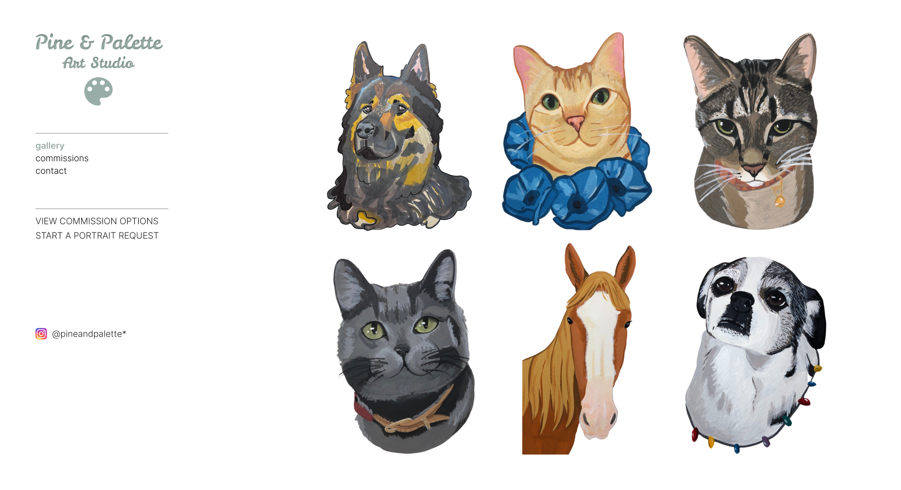
Purpose
This section introduces users to the artist’s work with a curated visual gallery. It serves as the homepage and primary entry point, setting the tone with the studio name, branding, and navigation. The goal is to engage visitors right away with a showcase of style and skill while offering intuitive access to commission information or contact options.
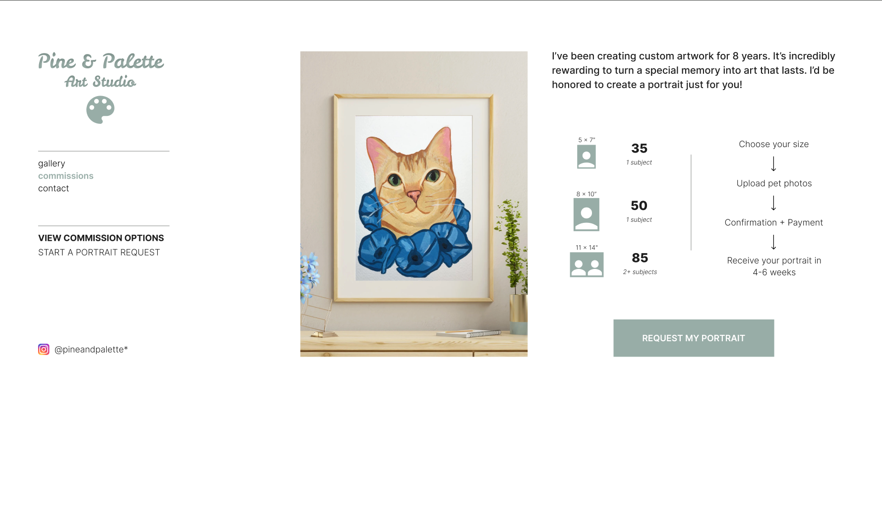
Purpose
This section provides a clear breakdown of portrait size and pricing tiers alongside a simple visual ordering process. It's designed to reduce friction for potential clients and make pricing transparent and approachable.
Left Framed Portrait
Showcases a sample commission in a realistic setting to help clients visualize the final product in their own space.
Portrait Size + Pricing Table (Center-Right)
Used iconography to help convey number of subjects at a glance and break up dense text. Sizes are listed in ascending order for ease of comparison.
Step-by-Step Visual Flow (Far Right)
A minimal vertical flow was used to communicate the process with clarity: choose → upload → pay → receive. This ensures that even clients unfamiliar with commissions feel confident proceeding.
CTA Button
“Request My Portrait” was intentionally placed below the process to create a natural visual hierarchy. Soft green matches the brand palette and feels inviting without being too aggressive.
Interaction Notes
When implemented, clicking the button would scroll the user to the “Request a Portrait” form rather than redirecting to a new page, maintaining a streamlined experience.
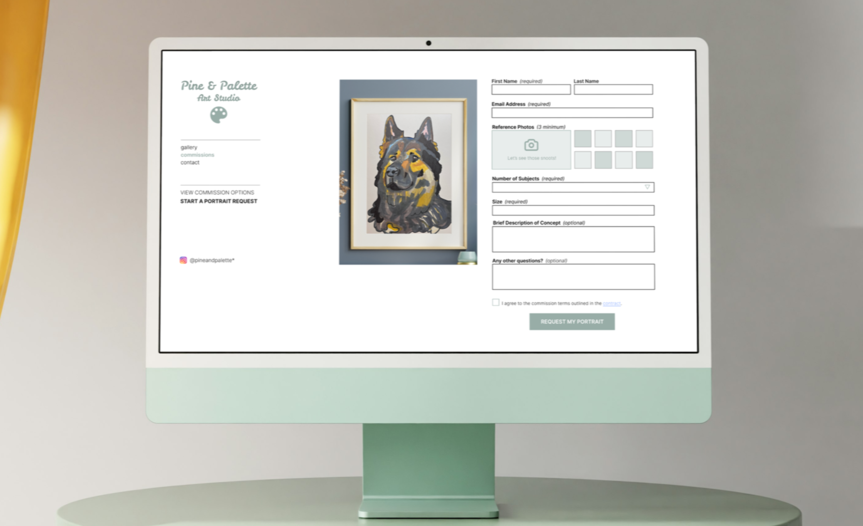
Form Layout
A clean two-column layout separates form fields from the portrait visual. This keeps the submission area easy to follow without overwhelming the user.
Reference Photo Upload
A visual grid reinforces the need for multiple photo uploads. The “Let’s see those snoots!” caption adds warmth and approachability.
Field Labels + Requirements
Clear labels and minimal styling keep focus on usability. Required fields are marked to prevent incomplete submissions.
Contract Checkbox
The contract mention builds professionalism and trust. It is designed to be unobtrusive, keeping the form approachable while still communicating essential terms."
“Request My Portrait” CTA
The CTA uses calm green coloring to blend with the brand palette while still standing out. Tone is assertive but polite.
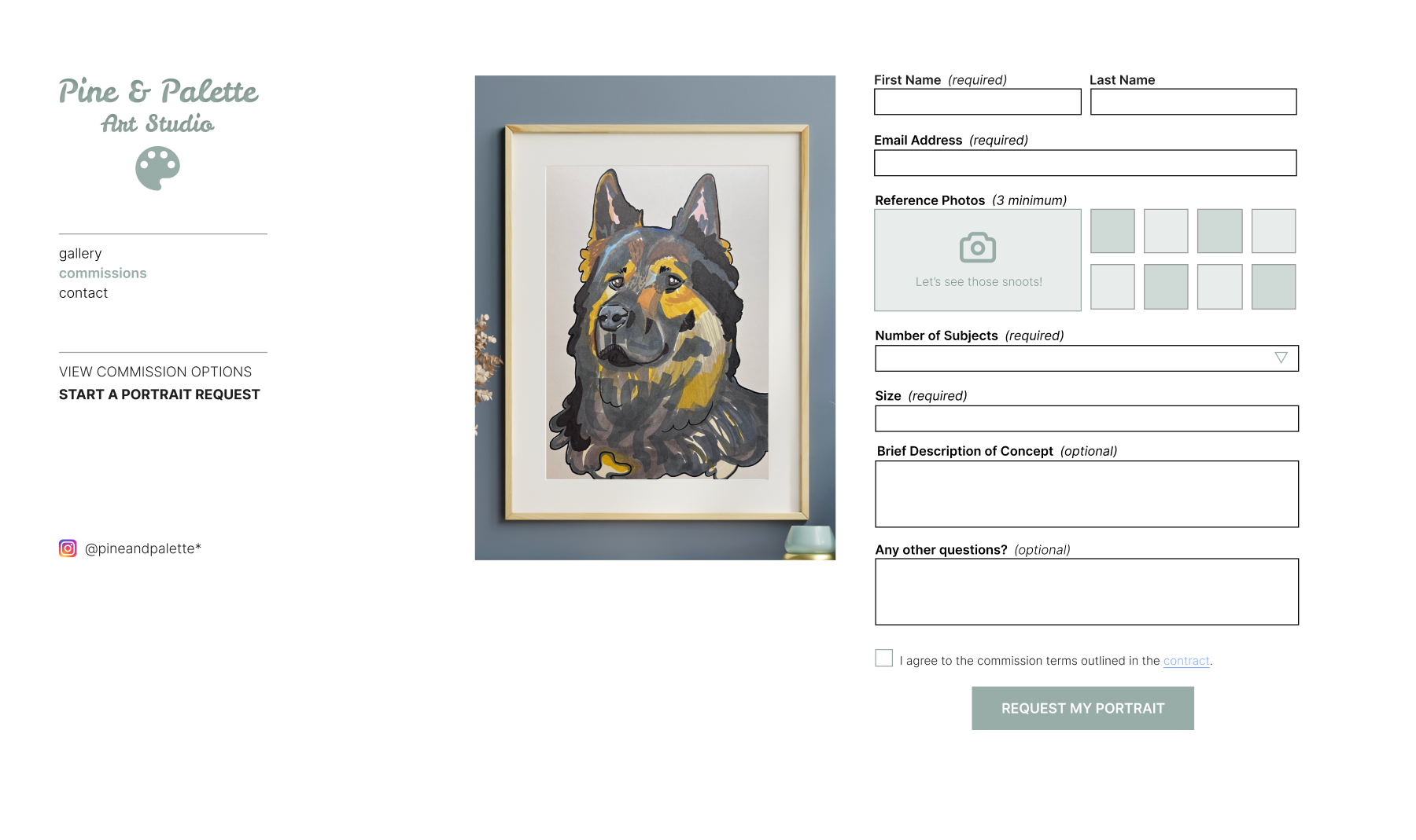
Purpose
This section allows users to submit all necessary details to begin a custom portrait request. It was designed to streamline the onboarding process while balancing clarity and approachability.
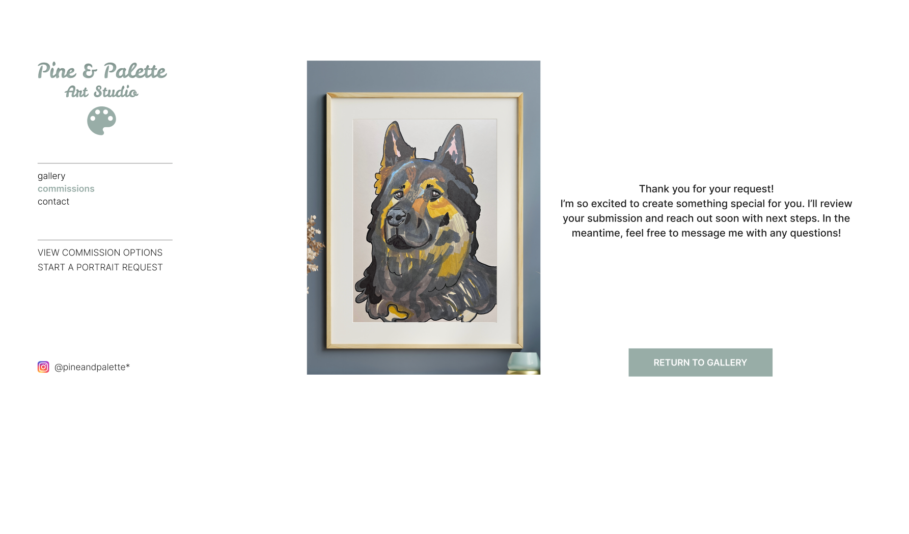
Purpose:
Provide a clear and friendly confirmation after a user submits their portrait request, reassuring them that their form was received and outlining what happens next.
Friendly tone
The copy remains warm and approachable without being overly casual, in line with the brand's overall personality.
Next steps included
Users are told what to expect (a follow-up and response), which helps reduce uncertainty.
Encourages follow-up
The invitation to message adds a personal touch and maintains
open communication.
Single CTA
“Return to Gallery” button avoids unnecessary complexity and guides the user back to exploration rather than ending the journey abruptly.
Visual consistency
Layout and framing image mirror earlier sections, maintaining visual continuity across the experience.
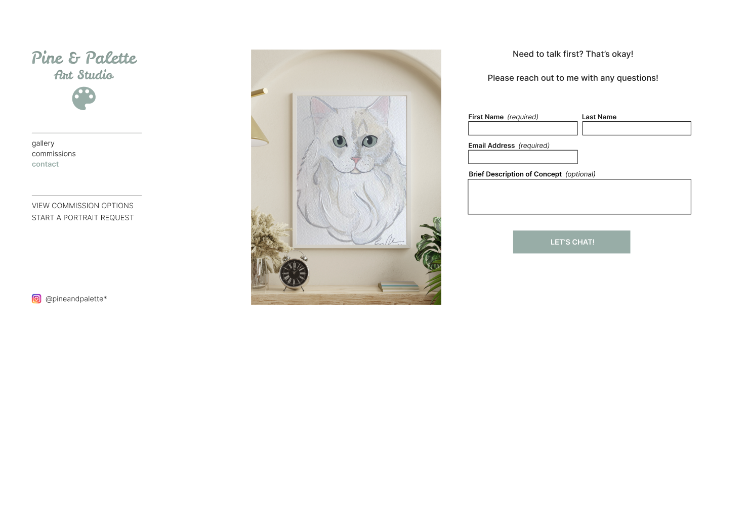
Minimal form fields
Simple and approachable to reduce friction. Only a name, email, and an optional message box.
Clear CTA
The “LET’S CHAT!” button feels friendly and inviting, matching the overall tone of the site.
Balanced layout
Visual consistency is maintained with the framed artwork and left-hand navigation, reinforcing brand identity.
Supportive UX
Ideal for users who are unsure or new to commissioning art, acting as a gentle entry point.
Purpose
Give visitors a low-pressure way to ask questions or start a conversation before committing to a portrait request.
Final Thoughts
Key takeaways included the importance of minimizing steps for the user, keeping the overall tone approachable without sacrificing clarity, and presenting options visually to reduce decision fatigue. The final design feels like an extension of the artist’s brand while guiding users with confidence.
